1996issue C121-7
Name the regime before the sector breakout
A classroom drill for sector rotation starts with the bond, commodity and equity regime, not with a single-name breakout. Only groups whose relative strength ratio and weekly moving-average gates agree stay on the list, and the relative strength index is kept as an environment check.
- Name the equity, bond, commodity and currency backdrop before any industry group is endorsed.
- Keep a group only when its relative strength ratio is rising or turning higher and the weekly moving-average gates still agree.
- Treat the relative strength index as an environment check, not as the trigger that lets a single-name breakout through.
- Rank industry groups from the top down, then review only a handful of names inside the strongest groups.
Read four markets before a sector list
Intermarket analysis is reading equities, bonds, commodities and currencies together to infer the growth-and-rate backdrop before choosing sectors. The archive described that practice as growing from visible links among a broad commodity index, bonds and stocks, then expanding to a joint watch of equities, commodities, bonds and currencies.
A moving average is a smoothed price path over a stated lookback. The relative strength ratio is a group or market series divided by a broad benchmark, plotted so a rising line means outperformance. Sector rotation is shifting exposure among industry groups as the inferred regime and ratio lines change.
Name the growth-and-rate regime
A growth-and-rate map placed pressure on bonds and a tilt toward cyclicals and natural-resource groups when the economy was firming and yields were rising. The same map tilted toward defensive consumer and rate-sensitive groups when bond prices were rising and growth was fading.
Early-recovery regimes were associated with small-capitalization leadership and later-recovery regimes with large-capitalization leadership. That pairing was one of a short list of rotation concepts used to place sector choices.
Admit a group only when both gates agree
Comparative strength was plotted as an industry or market price divided by a broad equity index. A declining relative strength ratio removed the group from interest. A previously weak ratio that turned higher was read as a return to favor.
A longer-term gate required price above a 40-week moving average before a group or stock was endorsed. A 10-week average was the nearer trend check. Pullbacks that held at the 40-week line were treated as still intact. Weekly 40-bar and 10-bar averages were those trend gates.
Editorial. The drill lets a sector through only when the ratio line and these weekly moving-average gates agree. A price breakout that fails either gate stays off the review list.
Keep the oscillator in its place
The relative strength index is an oscillator built from a fixed lookback of ordered closes. It was cited with other oscillators as useful only in some market environments. Moving averages were favored in trending conditions, and a weekly moving-average oscillator histogram was preferred for earlier trend-strength warnings.
Editorial. In this classroom the relative strength index does not trigger the sector choice. It only checks whether the setting is one in which that oscillator was treated as useful.
Rank groups, then open a short name list
The top-down screen ranked about 80 industry groups by percentage change over the prior week or month, then reviewed only a handful of names inside the strongest groups instead of thousands of charts.
After wide experimentation, the described style was reduced to trendlines, moving averages, a few oscillators and volume measures so cross-market work would not drown in indicator clutter.
Leadership can hide on the ratio line
An archive illustration showed a NASDAQ-to-broad-index ratio meeting prior resistance even as the NASDAQ price printed new highs, then later finding support and turning up. That sequence was visible on the ratio rather than on the raw price chart.
Fidelity Select fund relative-strength ratio, 1994–1996
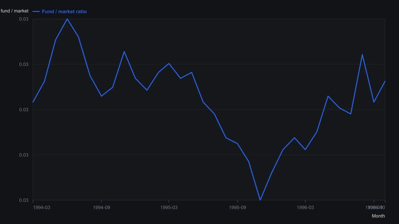
Source plot is weekly bars, March 1994 through October 1996. Each point is a visual month-end reading from the printed ratio scale, not a tabulated close. The platform title bar only shows a truncated Fidelity Select name.
All readings on this track · 33 readings
- 1990Policy-auction spread as a weekly equity regime filter
- 1992Electric utilities as bond-regime context
- 1992Reading the dollar as a rates-regime check
- 1992Evaluating weekly intermarket context for equity regimes
- 1993Specifying the stock-bond yield gap as a hold-or-abstain regime
- 1996Constructing dual-gate bond-fund entries from gold-silver jumps
- 1996Name the regime before the sector breakout
- 2002Falling prices flip stock-bond confirmation
- 2003Four sleeves on one regime board: gold miners, REITs, bills, and equities
- 2003Four currency regimes for the yen, loonie, pound and Australian dollar
- 2003Read gold through the dollar regime, the hedge spread, and a stop
- 2003When deflation flips the stock-bond map
- 2003Commodity subgroup regime boards and dual averages
- 2003Reading a liquidity regime when gold, bonds, and stocks rise together
- 2003A shared weekly checklist for four country funds
- 2004Size-and-style sleeves as a weekly regime map
- 2004Country closed-end funds shared one average checklist and four regimes
- 2004A 2004 four-pair snapshot of a dollar-bloc FX regime
- 2005Country closed-end funds as a weekly regime comparison
- 2005Weekly regime maps for production-weighted commodity subgroups
- 2005Four technology sleeves on one weekly regime map
- 2006The Australian dollar as a commodity regime and timing filter
- 2008Dual-listing moving averages as a crowd-regime test
- 2008Cross-market regime context for a single trade
- 2010Dollar index, cross rates, and commodity context for forex targets
- 2010Gold and silver forex session candles as metals-regime context
- 2012Yield curve regime and equity timing
- 2013Yield curve shapes as stock market regime context
- 2013Yield spreads as country-specific equity regime context
- 2016Credit spreads as an equity cash regime filter
- 2016The summer lull is a context error
- 2019Financial sector spreads as regime tells around a global stablecoin
- 2019The negative-yield regime as an equity intermarket filter