2012issue C1223-29
Yield curve regime and equity timing
A historical case study of Intermarket analysis that places one long equity stance against a normal 1990s Treasury curve, the inversion that peaked in December 2000, the 2001 curve flip and the later 2007 to 2009 equity drop.
- A normal curve keeps long-term yields above short-term yields. The 1990s stayed positive and at times steep while policy and credit rates declined and the S&P 500 made a nearly fourfold advance.
- The inversion that peaked on 18 December 2000 lasted 28 weeks after the funds rate rose from 4.71 percent to 6.5 percent, beside a crude rise from 11 to 35.91 dollars and faster home-sale price gains.
- After that peak the S&P 500 fell 47.6 percent from 1527.46 to 800.58. Rate cuts in 2001 flipped a 0.77-point inversion into a 3.56-point positive gap within 15 months.
- The case-study stance stayed long until the curve turned negative, including through the 2007 to 2009 drop of 52.9 percent. Editorial reading: treat the curve as a slow regime filter, not a day-to-day trigger.
This archive case study uses Intermarket analysis to place a single long equity stance inside a Treasury-curve, commodity and housing backdrop. The historical workflow reads the curve over weeks to months, alongside policy rates, crude and home-sale prices.
A normal curve and the 1990s backdrop
A normal curve is defined by long-term yields sitting above short-term yields. The archive illustrates that shape with a 10-year note at 1.57 percent versus a 90-day bill at 0.1 percent, a 1.47-point premium.
The 1990s featured a persistently positive and at times steep curve. The 10-year to three-month gap reached 3.81 points in April 1992, when those yields were 7.58 percent and 3.77 percent.
Across that decade policy and credit rates declined, crude averaged about 20.68 dollars a barrel, and home-sale prices rose 35.7 percent from 153400 dollars to 208100 dollars, about 3.097 percent a year. In the same stretch the S&P 500 rose from 315.23 on 1 January 1991 to 1320.28 on 31 December 2000, described as a nearly fourfold advance.
The inversion beside the 2000 peak
An inverted curve is defined as short-term yields above long-term yields. The episode cited peaks on 18 December 2000, with the 90-day bill at 6.06 percent and the 10-year note at 5.29 percent, a 0.77-point inversion.
That inversion lasted 28 weeks from 17 July 2000 to 22 January 2001, after the funds rate was lifted from 4.71 percent in June 1999 to 6.5 percent in November 2000.
From late 1998 to late 2000, crude rose from 11 dollars to 35.91 dollars and home-sale prices increased 14.9 percent, about 7.243 percent a year, faster than the prior decade's 3.097 percent pace.
After the 2000 peak the S&P 500 fell from 1527.46 in March 2000 to 800.58 in September 2002, a 47.6 percent decline over two and a half years.
The curve turns positive again
Rate cuts from 5.88 percent in January 2001 to 1.63 percent in December 2001 flipped the curve from a 0.77-point inversion to a 3.56-point positive gap within 15 months.
The later 2007 to 2009 equity drop ran from 1561.7 on 8 October 2007 to 735.09 on 23 February 2009, a 52.9 percent decline. The case-study stance stayed long until the curve turned negative.
Treasury 10-year minus 3-month yield spread, 1990–2012
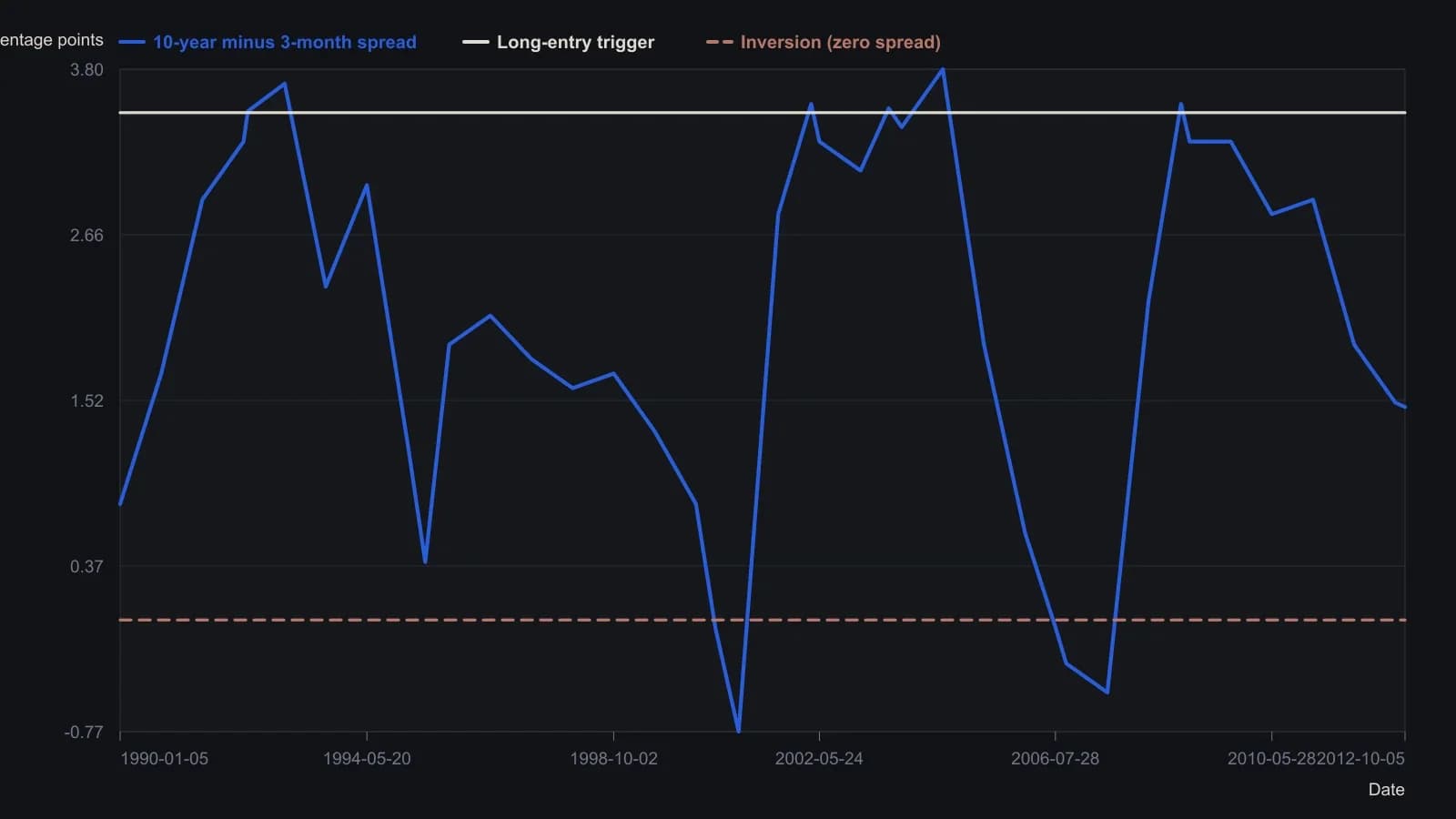
The raster has no printed vertical scale and overlays the S&P 500 on a second, unpublished axis, so only the yield-spread line was recovered. Intermediate vertices are to the nearest tenth of a percentage point, pinned to the article’s stated +4.0 to −1.0 range and to the tabulated signal dates. The S&P series was not converted into index points.
All readings on this track · 33 readings
- 1990Policy-auction spread as a weekly equity regime filter
- 1992Electric utilities as bond-regime context
- 1992Reading the dollar as a rates-regime check
- 1992Evaluating weekly intermarket context for equity regimes
- 1993Specifying the stock-bond yield gap as a hold-or-abstain regime
- 1996Constructing dual-gate bond-fund entries from gold-silver jumps
- 1996Name the regime before the sector breakout
- 2002Falling prices flip stock-bond confirmation
- 2003Four sleeves on one regime board: gold miners, REITs, bills, and equities
- 2003Four currency regimes for the yen, loonie, pound and Australian dollar
- 2003Read gold through the dollar regime, the hedge spread, and a stop
- 2003When deflation flips the stock-bond map
- 2003Commodity subgroup regime boards and dual averages
- 2003Reading a liquidity regime when gold, bonds, and stocks rise together
- 2003A shared weekly checklist for four country funds
- 2004Size-and-style sleeves as a weekly regime map
- 2004Country closed-end funds shared one average checklist and four regimes
- 2004A 2004 four-pair snapshot of a dollar-bloc FX regime
- 2005Country closed-end funds as a weekly regime comparison
- 2005Weekly regime maps for production-weighted commodity subgroups
- 2005Four technology sleeves on one weekly regime map
- 2006The Australian dollar as a commodity regime and timing filter
- 2008Dual-listing moving averages as a crowd-regime test
- 2008Cross-market regime context for a single trade
- 2010Dollar index, cross rates, and commodity context for forex targets
- 2010Gold and silver forex session candles as metals-regime context
- 2012Yield curve regime and equity timing
- 2013Yield curve shapes as stock market regime context
- 2013Yield spreads as country-specific equity regime context
- 2016Credit spreads as an equity cash regime filter
- 2016The summer lull is a context error
- 2019Financial sector spreads as regime tells around a global stablecoin
- 2019The negative-yield regime as an equity intermarket filter