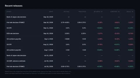
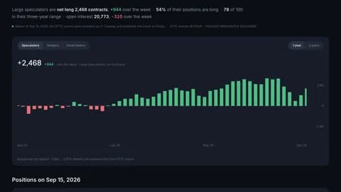
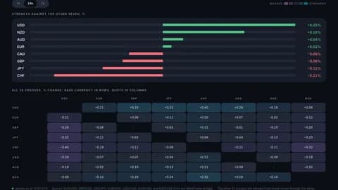
Market heatmap: the whole board in one picture
A new /heatmap page shows 40 crypto pairs sized by turnover and coloured by their move, with forex, indices and US stocks below — and the whole thing embeds on any site.
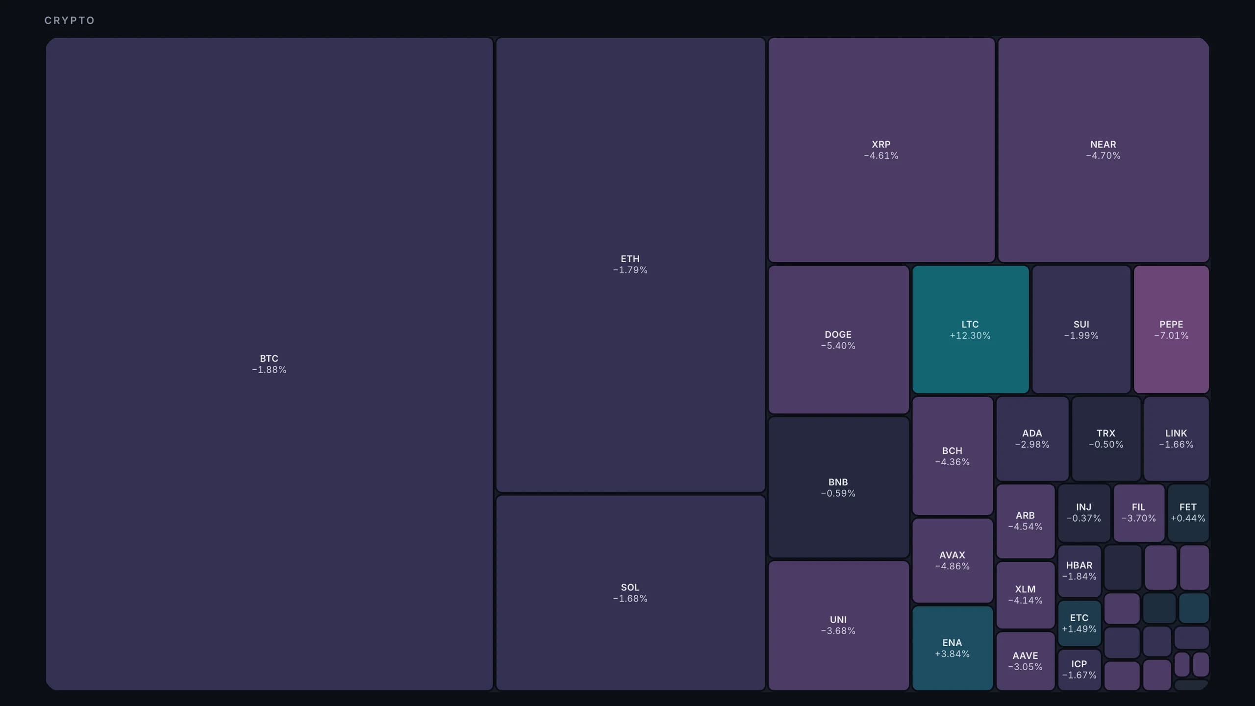
Size is turnover, colour is the move
The new page at /heatmap answers the question a watchlist never answers quickly: where is today's money actually moving. Forty crypto pairs are laid out as a treemap — the bigger the tile, the more turnover behind it over the last 24 hours; the colour is how far the pair has moved over the window you pick, one hour, one day or one week.
A tile is a link: click it and the instrument opens in the terminal on a real chart, with every tool you normally use.
Why the forex tiles are all the same size
Under the crypto map sit forex pairs, indices and US stocks — in equal tiles, on purpose. Forex volume reaches us as tick volume from a broker bridge, which is a count of price updates, not of money traded; sizing a tile by it next to exchange turnover would draw a picture that looks precise and is not. There the colour means something and the size does not.
Put it on your own site
The map is also a widget. Embed /embed/heatmap in an iframe and three parameters do the tuning:
- period — h1, h24 or d7, the window the colour reads.
- assets — all, or crypto to drop the lower strip entirely.
- theme — dark or light, so it sits inside your own page rather than on top of it.