A new look for TradersWeek: new logo, new site, a dashboard rebuilt for daily use
TradersWeek has a new logo and a redesigned site — home page, menus, product pages, a hub for our eight analysis methods and a dashboard reorganised around what you open most. On a phone, the dashboard now has a bottom bar with Trading one tap away.

A new mark
Our logo is now an asymmetric W with a signal node, next to a lowercase tradersweek wordmark. The favicon, app icons and the image that appears when you share a TradersWeek link were redrawn to match. The site moved to a single, calm light design on a grey canvas, so the theme switcher is gone; the terminal keeps its own light and dark themes.
Finding your way
- The header opens a full-width menu with columns and a featured card; on a phone it becomes a sheet you drill into. Language and search open the same way.
- The home page tells the story of a single demo trade, from entry to the graded result, alongside traders' ideas, the broker catalogue and the rewards ladder.
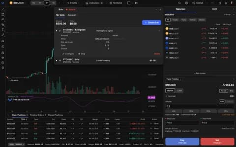
- Product pages were rebuilt around real terminal footage: the terminal, paper trading, indicators, patterns, drawing tools, the scanner, Strategy Builder, auto-trading, Script Converter and chart types.
- A new /modules hub has a methodology page for each of our eight analysis methods: Order Flow, Smart Money, Elliott Wave, Wyckoff, Gann, Ichimoku, Chaos trading and Expert Pro.
A dashboard for daily use
- The sidebar is grouped by how often you open each section.
- On a phone, a bottom bar holds Charts, Overview, Trading, Rewards and More.
- Trading is a report of your trades rather than a wall of tiles; the TW shop reads like a price list; alerts are a table with the same columns as the terminal.
- The bell gathers replies, TW credits earned in the last 24 hours and moves up the weekly ranking into one feed, instead of pop-up toasts.
Brokers, research, help, pricing, rewards, the free tools and the rest of the site moved to the new design too. Take a look from the home page.