2003issue C051-5
Log scale trendlines and compound growth
The same monthly price series can support a drawable multi-year trendline on a logarithmic scale that cannot be drawn on a linear scale. Scale choice changes which trend conditions can be hypothesized, and it also changes how moving averages and fitted lines should be built.
- The same monthly price series can support a drawable multi-year trendline on a logarithmic scale that cannot be drawn on a linear scale, so scale choice changes which trend conditions can be hypothesized.
- Two successive 100 percent price doublings produce the same dollar profit on equal capital, but a linear chart makes the later move look four times larger while a logarithmic chart shows the two percentage moves as equal.
- A moving average computed on raw prices and then plotted on a log chart can diverge from one computed on the logarithms of prices and converted back, and the gap widens as the lookback lengthens.
- For linear regression on a logarithmic chart, the line should be fit to logged prices and converted back. Fitting raw prices and overlaying the result can produce a distorted line.
Scale choice changes the hypothesis
Chart-scale analysis is the work of choosing and reading the price axis so a repeatable chart condition can be drawn, tested, and falsified. The same monthly price series can support a drawable multi-year trendline on a logarithmic scale that cannot be drawn on a linear scale, so scale choice changes which trend conditions can be hypothesized.
A linear scale spaces equal dollar increments evenly, so later absolute moves look larger than earlier ones of the same percentage. A logarithmic scale spaces equal percentage increments evenly, turning constant-rate compounding into a straight line.
Equal percentage moves
Two successive 100 percent price doublings produce the same dollar profit on equal capital, but a linear chart makes the later move look four times larger while a logarithmic chart shows the two percentage moves as equal.
A logarithmic price axis advances by multiplying by a constant rather than adding a constant. Major divisions can be labeled as successive powers of ten even if another base is used.
Compound growth on a semilog plot
A semilog plot is a chart with a logarithmic price axis and a linear time axis, used to inspect multiplicative growth. Compounded constant-percentage returns produce an exponential equity path that appears curved on a linear scale and closer to a straight line on a semilog scale.
A wide-range long-horizon index chart can hide multi-decade advances and consolidations on a linear scale that become readable after the same series is plotted on a semilog scale.
Averages and fitted lines on a log chart
A moving average is a lookback average of prices, or of logged prices converted back to price, used as a quantitative baseline. A moving average computed on raw prices and then plotted on a log chart can diverge from one computed on the logarithms of prices and converted back. The gap widens as the lookback lengthens.
Working in the exponential domain means using logarithms of prices so multiplicative growth becomes additive, then converting results back with an exponential.
Linear regression is a fitted line through ordered observations. On a log chart it should be fit to logged prices and converted back to price. Fitting the line to raw prices and overlaying the result on a log scale can produce a distorted line.
Short-lookback studies calculated in price space and in the log domain tend to stay close enough that the extra conversion is often skipped, while long-horizon regression is the case where the conversion matters most.
Dell weekly closes and 200-bar averages on a log scale
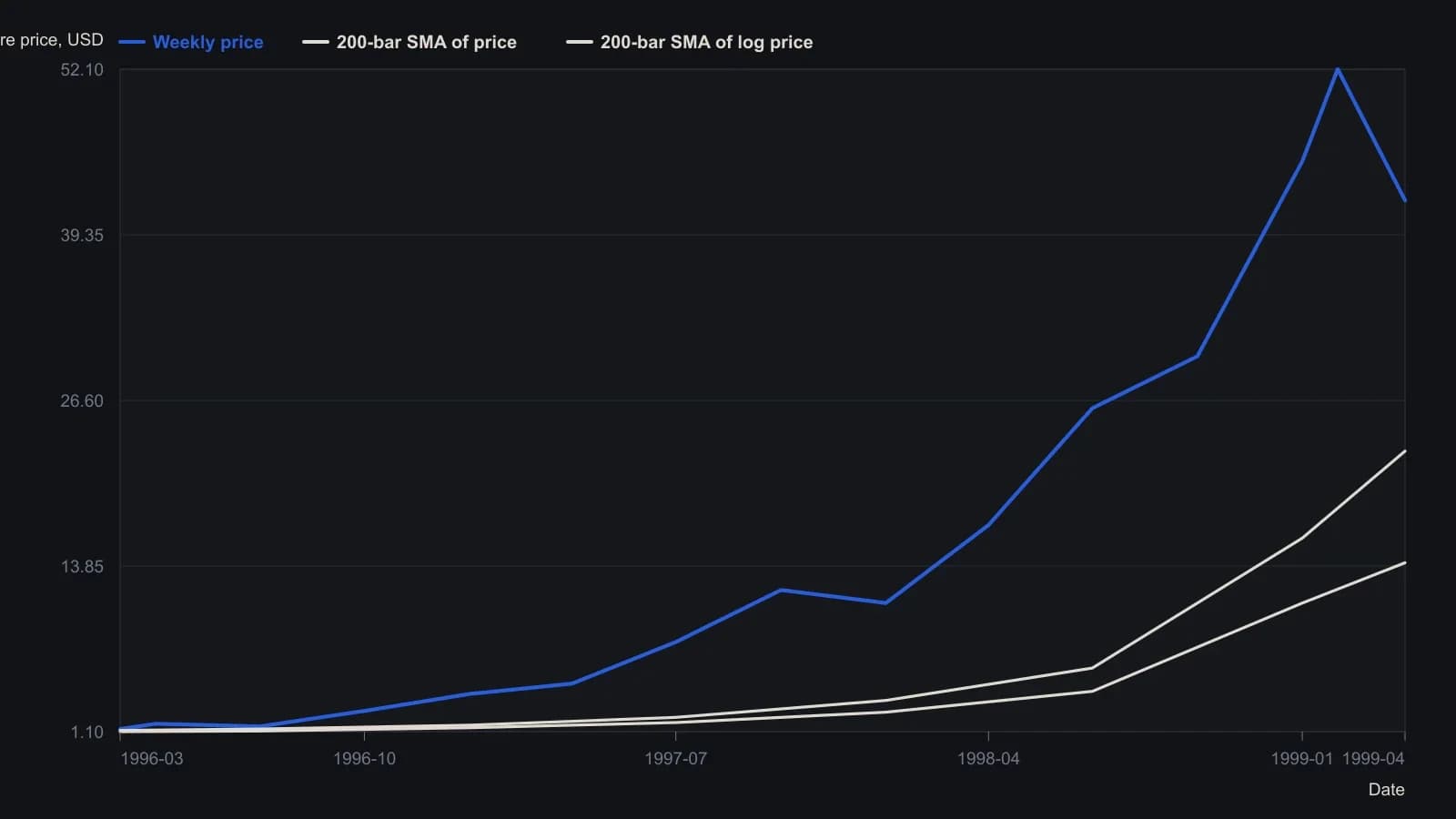
The log-domain average is the exponential of a 200-bar simple average of natural logs, given in the source as Exponential(MA(NatLog(@), Sim, 200)). Intermediate levels are approximate readings from the weekly log plot; 22.70 and 14.10 are the labeled endings.
All readings on this track · 14 readings
- 1982Constructing semi-log scales for trend channels
- 1988Treat a suspected bend as a construction test
- 1989Constructing percentage-box point-and-figure charts
- 1989Constructing point-and-figure objectives across chart scales
- 1991Unfinished point-and-figure until filter, scale, and pivots measure percent
- 1992A logarithmic point-and-figure construction with weekly breadth scores
- 1995Constructing a least-squares trend channel with two-standard-deviation rails
- 1995Percentage boxes turn a three-box reversal into a scale decision
- 2003Log scale trendlines and compound growth
- 2007Trendline and channel construction on linear versus log scales
- 2012Constructing trend-intensity overlays across chart scales
- 2015Index drawdown caps, chart-scale stops, and leverage
- 2016Evaluating breakouts by share-price band
- 2016Constructing chart scale with a golden-rectangle aspect ratio